Friday, 20 May 2011

Pattern development


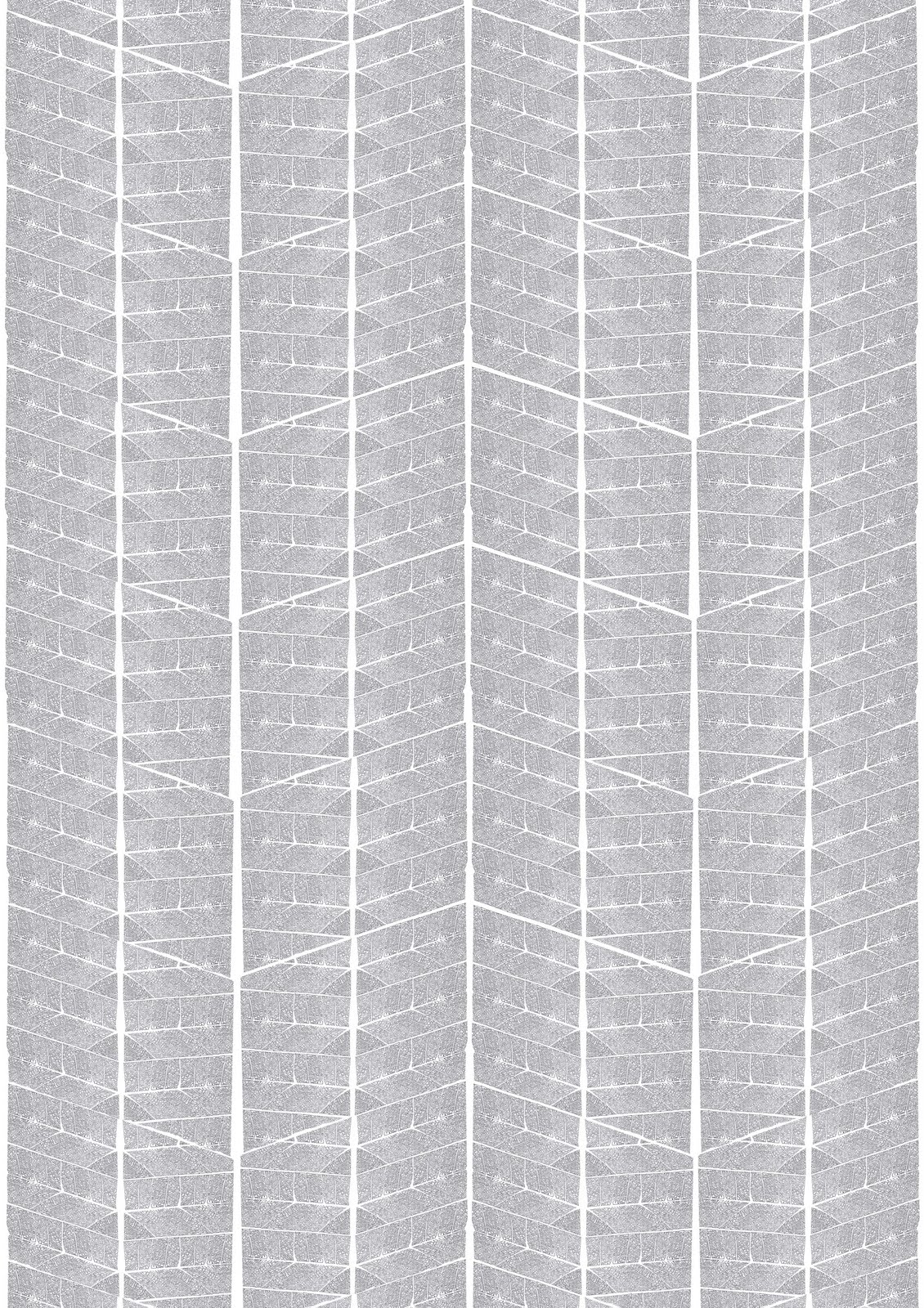
These are the alternative fractal pattern layouts I created for the Degree Show. They all use the same self-similar fractal pattern, however I have changed the scale of each one depending on how many "drops" of pattern will fit in the wall space.

Thursday, 12 May 2011

Maquette


This is a maquette of the space I will be using for the Degree Show. I built it mainly to be certain that the position of the pattern and mirrors would reflect in the way I want it to. Also, it enabled me to test smaller versions of my patterns to ensure the reflected image would not affect the repetition. This is a very helpful task to do when creating site specific work and designing interiors.


This model helped me to see how the finished piece would look from both inside and outside the space, however trying to photograph the scaled down version was more difficult than anticipated!

Wednesday, 11 May 2011

Flaws and All


I love the flaws that occur in my work, especially through screen printing. After all, nothings perfect.


Tuesday, 10 May 2011

Richard Wilson 20:50


For me, this is the ultimate in site-specific art.

Richard Wilson uses every milimetre of the interior space to fill with a trough of oil; the perfect reflection creating alternative dimensions within the space. Although this work has been repeated in different spaces, each time it is completely different due to the changing architecture and measurements.

Although this work is not exactly interior design based, the site-specific concept and reflective element link strongly to my own work.

I try to incorporate this unique quality into my interior design work; increasing the grandeur and importance of contemporary decor.

Self-similar fractal print (2)


This is a scaled down version of the pattern i will be using for my Degree Show work.


This is the section of pattern that will be made into a screen for printing. A mirror image of this will also be made to create the second half of the pattern.

Because the work is site specific, the pattern has been designed to fit the wall on which it is going, rather than scaled to fit the width of wallpaper.

Friday, 29 April 2011

My wild Friday nights...


Garden designed by Cecil Pincent

While most students spend their Friday nights partying, I spend mine watching Gardener's World and, most recently, Monty Don's Italian Gardens. This may seem an unusual choice of Friday night entertainment for a 22 year old student but these programs have given me much inspiration for new floral patterns, introducing me to interesting and unusual flower shapes, colours and combinations. Even the scientific elements to the programs have given me unique ideas about developing pattern on paper and fabric.

Monty Don's Italian Gardens has given me an insight into how the formal gardens of Florence were designed, such as Boboli Gardens created during the Medici Dynasty and later, the gardens designed by Cecil Pincent. The techniques used to lay out these beautifully structured, symmetrical gardens can easily be applied to wallpaper pattern.


Planting grid commonly used in formal garden design. Works well in wallpaper pattern design as straight lines can be seen horizontally, vertically and diagonally, making the overall layout visually aesthetic.


Tuesday, 19 April 2011

Self-similar fractal print (1)


This is my first print test for the self-similar fractal design. Although the theory is there, the more detailed sections were so small that the clarity of print was lost. I do find that the flaws in the print add to the piece- I have always embraced the mistakes made in the creative process as they often produce new ideas, new patterns and also highlight that the pattern is unique and not something easily re-produced. If I had printed digitally I would lose all this.

I have made a conscious decision to use black and white for this print. The pattern is quite ambiguous and the self-similar theory suggests many elements within nature, therefore, I do not want to force an opinion on the viewer as to what the pattern represents, I feel it is more important for the pattern to speak for itself as different people will view it in different ways. As I have mentioned in previous posts, using colour will influence what the pattern may be and in this case I do not want it to be so definite.

Monday, 11 April 2011

Further colour prints

Bronze print on Baghdad Brown Bronze print on Ebony Bronze print on Royal Blue Bronze print on Forest Green

Wednesday, 6 April 2011

Everything isn't always so Black and White

Gold print on Emerald Gold print on Harvest Black print on Natural Gold print on Claret. As I predominantly work in black and white when producing patterns for wallpapers, I thought it would be interesting and worth-while to see how my fractal wallpaper patterns looked in and on different colours. Due to the ambiguity of the pattern, using colour could affect how it is portrayed. For example, if the pattern was printed onto a green background and/or in green ink, it would imply that the pattern is linked to nature (trees, leaves, branches). However, if the colour red was used then this would have a much more biological appearance (veins, blood). Also, using colour may be helpful when designing more commercial patterns for example, using metallic inks or paper within an interior space can be interestng as they are affected by both artificial and natural light and the architectural contours of the space. I work in black and white as I feel this does not detract from the pattern or force opinion onto the viewer. Yet commercially, where interior design is concerned, colour can be extremely important depending on the architectural space and function of a room.

Monday, 7 March 2011

Mirror, mirror


My initial mirror experiment worked relatively well, however it was rushed and this is obvious in the photographs (the lack of straight edges on the mirrors!) After cutting them down to more workable shape, I made a more solid structure which would bounce the pattern infinitely around the space created by the mirrors. Instead of it looking simply like a papered box, the space appears to be limitless- as does the pattern, and scale becomes ambiguous.

Depending on the angles of the mirrors and position of the pattern, the affect achieved can vary. For example if a mirror is placed at right angles on either end of the pattern facing inwards, this creates an illusion of a corridor. If the mirrors are moved to a more obtuse angle then the 'corridor' appears to bend and the pattern has an off-centre vanishing point. The pattern could be placed on the floor/base and then surrounded by mirrors-this creates an expansive carpeted effect.


What really interests me with this experiment is how it is possible to subvert a confined space using mirrors. Similarly to the way we use mirrors in interior decoration, we can make a space appear larger than it actually is. In this experiment, what looks like a box from the outside suddenly changes to appear infinite when looked into. This idea reflects the basis of the wallpaper pattern. The fractal design, when looked at in detail, gives the impression that it could be repeated infinitely and remain looking almost the same.

Tuesday, 1 March 2011

Fractal Wallpaper- experiment


Fractal patterns are self-similar, this means that if you zoom into a small section of the pattern, it will look similar (if not the same) as its whole. Self-similar patterns occur frequently in nature, especially in horticulture which is my main influense when designing new patterns and wall coverings.

After designing my initial fractal wallpaper, i was interested in looking further at the self-similarity theory. I want to find a way of repeating my pattern in the same way we see fractals behaving in nature. To do this, I think mirrors palced at right angles to the wallpaper will bounce the pattern in a mirror image; the more mirrors I use, the further the pattern spreads. I think using mirrors for this design is the best choice as the pattern itself is quite geometric, so the angles of the mirrors against the wall will compliment this. Also, as my work is based around interior design, the mirrors are inkeeping with the environment in which I see this particular work.

Capillary Action- Further tests


  • Machine embroidered pattern in white thread on white fabric
  • Hand sewn, hem-stitched pattern in white thread on white fabric
  • Time test- dye soaked from top and bottom of white fabric
Although the embroidered tests appeared to work initially, after a period of time the thread began to reject the ink (due to its synthetic coat) and so the pattern revealed was the opposite to what I was expecting. This still looked effective but I was disheartened by the time and effort it took to create such a small test.
As well as this, the overall process is very tedious and I am rapidly losing interest in this particular element of my work. I feel it has become too focussed on the process and has lost sight of the initial idea. My work is based around interior design, decoration and surface pattern. This project was ideally meant to finalise in a wall hanging which 'grew' over time, however after testing the design ideas I realised how time consuming and expensive it would be to reproduce on a large scale; creating a damp environment and watering system suitable for maintaining the 'growth' of the pattern.
With this in mind I have made the decision to put this project to one side and focus more on developing fractal wallpaper patterns to print.

Capillary Action


This is my first capillary action wall hanging test which incorporates the self-similar fractal pattern theory. The idea is to use similar methods as plants and flowers, to make a pattern"grow" on the fabric. Here, the basic branch pattern has been embroidered onto the fabric, however the dye pockets have been stitched into the reverse. The hanging is then rested in water so that it can be absorbed, working up the fabric. When the water hits the dye packets on the reverse the colour begins to dilute and spread like blossoming flowers.
Whilst doing this test there were certain things I noticed which affected the way in which the dye spread across the fabric. For example, the dye (quite obviously) follows the water flow, but it is also affected by the stitch on the fabric. In my next experiments I will see if I can manipulate these obstacles to improve the pattern.

Thursday, 6 January 2011

Fractal Wallpaper


I created this wallpaper using the screen-print method. I used my hand drawn fractal image as the basis for the pattern as I prefer the added textures and flaws that these manual techniques provide. I could have transfered my pattern into digital software to polish the lines and improve the joins, and if this was being produced for a commercial environment I would have done this. However, for me the manual processes of producing the work is just as important and enjoyable as the result, so I try as much as possible to maintain these methods.
Many of my designs begin life as a 2D pattern or image before moving forward to more innovative ideas. With this design, I now plan to incorporate it into a fabric piece using the capillary-action method from my previous work, and attempt to "grow" the fractal pattern on the fabric wall hanging.

Fractal Patterns

After producing the piece "Floral Hanging" in October which used capillary action to create colour and pattern, I chose to further my research in natural growth and other processes in plants and flowers to find other possible methods or patterns for wallpaper designs.
Much of my work in this medium is influenced by horticulture and natural pattern so I found it very interesting and inspiring to look beyond the mere aesthetics of floral patterns in wallpaper and consider a more scientific approach.
The fractal pattern idea came to me after watching a natural history programme on which it was explained that the first living organism was formed through the simpest of fractal formations. I find fractals are aesthetically pleasing in themselves and the more I looked into it I realised how common they were in nature from trees and leaves, vegetables such as brocolli, and even cloud and lightening formations.
Keeping with the theme of horticulture, I have begun drawing simple plant-like factals and plan to develop these into screen-printed wallpapers and later, experiment with combining the fractal patterns with the time based 'capillary action' method to create a wallpaper that not only mimics the pattern of plant growth but also the method in which it grows and spreads.

Wednesday, 8 December 2010

Wall(tracing)paper


As I enjoyed working with tracing paper on the piece "Anthurium", I decided to further experiment with it in a wallpaper based project. What I particularly liked about the tracing paper as a medium was its transparency, lightness and movement, and it was these three elements I wanted to accentuate in this wallpaper design.

I wanted to create a wallpaper that would interact with the presence of the people who walked by without being overtly visible. The use of plain tracing paper links to the opinion that much of the time, everyday wallpaper goes unnoticed-it is not until somebody passes by this wallpaper that its presence becomes clear. The thin, cut-out strips sway and rustle lightly as the person moves and displaces the air infront of it.

As is often the case, time and space restraints meant I was only able to produce one strip of wallpaper for the 'Link' exhibition (mid year exhibition) so it was not as effective as it could have been if it covered more space. However, I plan to further this work and possibly collaborate with a fellow student who's work is based around the movement of people. We will look into the possibilities of projection onto the wallpaper ans well as filmed documentation and photography.

Tuesday, 23 November 2010

Front Design Company "Rat Wallpaper"


This particular piece of work is perhaps one of my favourite pieces of alternative wallpapers I have seen. The artists placed rolls of plain white wallpaper in a cage with some rats, knowing that the rats would inevitably gnaw at the paper making holes through it. As the paper is unrolled, a lace effect emerges that is entirely the rats' design. This "Rat Wallpaper" is then hung in front of existing wallpaper, revealing small sections of it to the viewer. This way there is a comparison between traditional decorative design and contemporary art.
The piece challenges the usual role of decoration and indeed challenges how decoration can be created. Front Design Company is in a way handing over the design aspects of their wallpaper to a more spontaneous creator, removing their own control and allowing risk to take over.
Like the majority of Front's work, what stands out the most with this is its humour, and it is this refreshing lighthearted take on the subject that makes it such a favourite of mine.


Sunday, 14 November 2010

Linda Florence "Sugar Floors"

Linda Florence is an arist I have become interested in while researching for my university dissertation. Her work, like mine, is based around interiors, especially wallpaper. This particular piece named "One of a Kind Tea Dance" was installed in 2008 in the V&A museum as part of the artist's "Sugar Floors" project.
The piece is a floral wallpaper-like print applied to the floor of the gallery using white sugar and presumably a stencil. Ballroom dancers then took to the floor; their graceful movements shifting the original sugar pattern, creating a new pattern with the traces of their dance steps and turns.
By doing this, the artist is allowing an element of risk into the work as it is not certain where the dancers will go, how the pattern will change and whether the new pattern will be effective or not. With much of her work, Florence challenges the normal concept of wallpaper and pattern. Here she pushes the boundaries of the medium by placing a wallpaper pattern on the floor. Why should we stop when the wall reaches the floor or ceiling?
I think this piece is extremely beautiful and delicate and is a refreshing way of using the medium of wallpaper when so many others use it as a tool for political comment. However it is questionable as to whether the piece can still be considered a wallpaper when it is placed on the floor. But then again, who can possibly say?!
It was interesting that I came across this piece after I produced my work for the No.5 Balmoral project as the basic concept is so similar. It has however increased my interest in interactive patterns and decoration, and Florences other work has opened up many new ideas of manipulating the medium of wallpaper.

Wednesday, 3 November 2010

Christopher Pearson "Environment sensitive wallpaper"


For many wallpaper designers and artists, William Morris has been a huge influence. This is clear with artist Christopher Pearson and his piece "Environment sensitive wallpaper". This design is almost a replica of Morris's "Willow Boughs" 1887, with the same repeats and very similar colours. However, the wallpaper pattern is created in a way so that it reacts with UV exposure and the temperature in the room that it is displayed in. The effect is that the pattern develops 'naturally' over time the more exposure it gets; and appears to grow and spread over the paper. Presumably this is done using heat and light sensitive paper or paint but there is little information given about this.
The fact that it's reactants are heat and UV exposure poses questions on the wider environment and the effects we have on the planet and the environments we live in.

I would like to find out more about the technical methods the artist has used as it would be very useful for me to use as a method of conveying my own wallpaper designs and ideas on horticultural patterns.


Sunday, 10 October 2010

Floral Wall Hanging


"Floral Wall Hanging" is a textile piece I created for the Collective Vision exhibition, part of the Free For Arts Festival. Staying with the theme of interior decoration, i created this piece to experiment with different elements such as time and alternative methods of developing a design or pattern. Previously, my work centred around its interaction with the viewer or vise-versa, this time however I wanted to focus on reaction rather than interaction. I wanted an item which, once set up, could be left over time to change and develop in its own way without interference from myself or other viewers.
Due to the time consuming nature of producing the fabric hanging, it was not necessarily as large as I'd have hoped, however the effect of the capillary action is still striking yet subtle at the same time. What I enjoyed most about this piece is that, once in place, I had no control over how the colour spread and absorbed into the fabric and so some element of the final design is left unknown.
The capillary action is the most important element of the wall hanging as it is this link to horticulture that follows through the majority of my wallpaper and fabric designs. I intend to continue with this idea of capillary action and "growth" of pattern and colour within the wallpaper/wall hanging.